Have you ever looked at a car and thought it looked cute? Have you ever seen a cartoon character that gives you the creeps? As it turns out, there’s a lot of psychology and neuroscience behind these emotions.
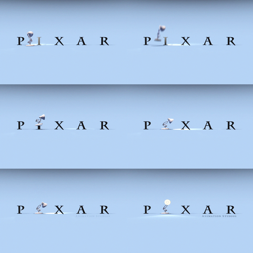
Let’s start with an unusual example: this lamp.

There’s nothing cute-looking about this lamp’s appearance. It doesn’t have an endearing British accent, and it doesn’t call sugary flakes grrrrreat. But when people saw this lamp spring into action for the first time, it bounced straight into the hearts of audiences across the world.
So what’s going on here? How did Pixar melt our hearts with a high-powered lightbulb?
Well, before we get there, we need to back up and talk about a concept called anthropomorphism. Anthropomorphism is the innate instinct that humans have to give animals and inanimate objects human-like characteristics.
Humans are hard-wired to assign motivations, intentions, and emotions to animals and inanimate objects alike. Some studies even suggest that this is something we do as early as birth, one study concluded that babies preferred face-like stimuli compared to non-face stimuli.¹
Why are we engrained to humanize things? Well, a few different reasons:
- We understand the most about human behavior.
- We are motivated to explain the behaviors of others.
- We thrive off of social connections.
Physical Similarity: When Mascots Look Like Us
Physical similarity plays a big role in helping people anthropomorphize. While we have a tendency to anthropomorphize many things, we actually have an easier time giving life to something when it looks more human.
So that’s where mascots and brand characters come in. When advertisers dream up talking tigers or even a giant pile of tires to be their spokes-things, they tend to begin by picking an animal, or some marshmallows look-alikes, and making it fun, relatable, and ultimately, more physically human.
But the recipe for successfully making something more human – anthropomorphizing – isn’t so simple. A marketing study compared anthropomorphized bears and lions, as well as bears and lions in their original forms. It found that – all else held equal – people preferred the bear, given that it can stand on two legs and has a higher physical similarity to a human than a lion.²

So physical similarity to humans matters, but we can think of it as more of a spectrum. Sure, it’s not impossible to anthropomorphize a lion, bears just simply lend themselves better to this because they fall closer to humans on that spectrum. In the end, the study’s participants preferred to keep the lion in its original lion form.³
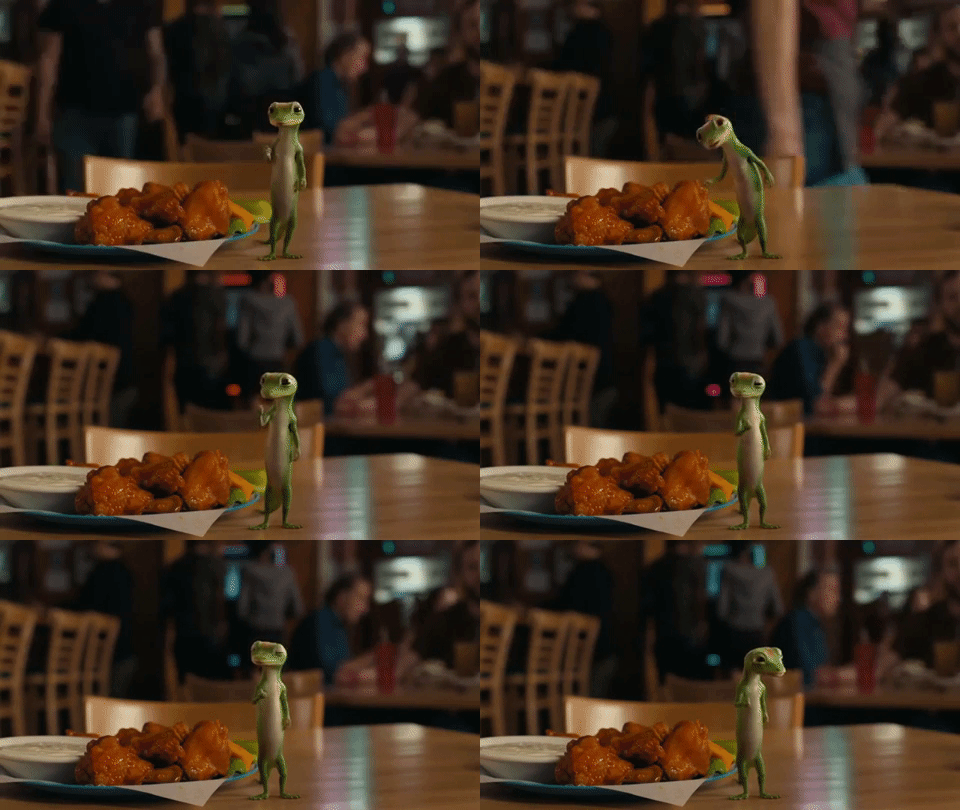
Enough hypotheticals, let’s talk about some heavy hitters in the business – the Geico Gecko and the Aflac Duck. We all know Geico hit a home run with their Gecko ads. From the very first ad, we were won over from the first appearance of everyone’s favorite quirky, well-spoken, and endearing spokesgecko. Advertising magic? Well actually, Geico’s secret sauce has more neuroscience going on than we think.
Running down the list of physical similarities the character plays on, insurance’s favorite reptile stands on two legs (in case you’re not from Florida, real geckos tend to walk on all fours), uses his fingers to give us a thumbs up, burns his human-like lips with spicy buffalo sauce, and wins over our hearts with his expressive eyes.

But what about Aflac? It’s a long road to turn a duck into a human, so rather than go in on a creepy Donald Duck impersonation, Aflac humanized their spokesduck in a different way: they make him do human things like swim with goggles on or sit a desk flapping away on a keyboard. A winning strategy for the company!
https://www.youtube.com/watch?v=U7J4k7w0_5I
Movement: When Mascots Move Like Us
But anthropomorphizing is much more than making it look like a human – sometimes, it’s enough to move like us! This is especially important when it comes to bringing inanimate objects to life!
In one research study, participants were shown animated videos of a blob going down the street, eating cars and lamp posts. Each video presented the blob moving at different speeds: ultra-fast, ultra-slow, and a pace that matched how a human would move. Turns out, the video of the blob moving at human speed was the only one where participants attributed human characteristics to the blob. Even a shapeless blob could be anthropomorphized when it moves like humans!4
And this is exactly how Pixar sold us on that lovable lamp. While doing nothing to change its appearance as an ordinary lamp, Pixar impressed moviegoers everywhere with the way its mascot was able to hop around, scrunch down to build up a jump, and move its head around in wonderment as if it was a kid experiencing Legoland for the first time.
Uncanny Valley: When Are Mascots Trying To Be Us
So now we know more about using neuroscience to make a great mascot. But what about some cautionary tales? When it comes to animating humans, there are a few things to keep in mind. Trying to make a character as human-like as possible may not be the best route, because more human is not always better.

In comes the Uncanny Valley – a phenomenon that suggests that humanoid objects that appear almost, but not quite, like real human beings elicit a feeling of discomfort and revulsion in observers.5 Different research has shown, that when it comes to animating humans 65% is the sweet spot.6

This was a lesson that our friends at Pixar learned the hard way. In 1988, Pixar released Tin Toy, which went on to be the first computer-generated animated short film to win an Academy Award. Although critics praised it for its technological advancements, audiences hated it, because, well, just look at it! The almost-human but something’s wrong feeling we get from the appearance of Billy the baby puts it right in that uncanny valley.
After Tin Toy, Pixar revised its entire approach, and shaped its animation strategy to stick to a more cartoony appearance, with characters from its popular films now closer that 65% human sweet spot rather than attempting to make its characters exactly human.
Let’s end on an advertising favorite: 2017’s Mr. Clean Super Bowl Commercial. We put this true example of a winning mascot to the neuro test. As it turns out, this ad captured its audience and kept engagement high throughout. Not only was the commercial storyline effective, but Mr. Clean’s animated rendition was just the right amount of human. No Uncanny Valley here…
¹ Epley, N., Waytz, A., & Cacioppo, J. T. (2007). On seeing human: a three-factor theory of anthropomorphism. Psychological review, 114(4), 864.http://citeseerx.ist.psu.edu/viewdoc/download?doi=10.1.1.457.4031&rep=rep1&type=pdf
² Connell, P. M. (2013). The role of baseline physical similarity to humans in consumer responses to anthropomorphic animal images. Psychology & Marketing, 30(6), 461-468.https://onlinelibrary.wiley.com/doi/full/10.1002/mar.20619
³ Connell, P. M. (2013). The role of baseline physical similarity to humans in consumer responses to anthropomorphic animal images. Psychology & Marketing, 30(6), 461-468.https://onlinelibrary.wiley.com/doi/full/10.1002/mar.20619
4 Morewedge, C. K., Preston, J., & Wegner, D. M. (2007). Timescale bias in the attribution of mind. Journal of personality and social psychology, 93(1), 1.
http://labs.psychology.illinois.edu/pramlab/Papers/Morewedge_Preston_Wegner(2007).pdf
5 Mori, M. (1970). The uncanny valley. Energy, 7(4), 33-35.
6 Looser, C. E., & Wheatley, T. (2010). The tipping point of animacy: How, when, and where we perceive life in a face. Psychological science, 21(12), 1854-1862. http://media.virbcdn.com/files/ae/FileItem-181443-LooserWheatley2010.pdf
Recent Comments